Toolbar
One of the most important tools for creating new interfaces is the Toolbar. It is a dynamic bar where you can always adjust the most important or commonly used properties of a component, while all other component properties are provided in the Detail Panel.
The properties of the component are usually directly adjustable or accessible via a submenu (Toolbar Extension).
To display the settings contextually, there can be a separate Toolbar for sub-elements of a complex component. To do this, double-click on a sub-element to select it, and you can switch back to the main Toolbar via the Back Button.
The Toolbar is always displayed for the active component. If it obscures important elements, it can be moved via drag & drop or fixed at a position using the pin button.
Additionally, you'll find a Delete Button (1) to delete the component or the Detail Panel button(2) to toggle the visibility of the Detail Panel.
Basepicker
The following pickers will be available for each component:
Status Picker
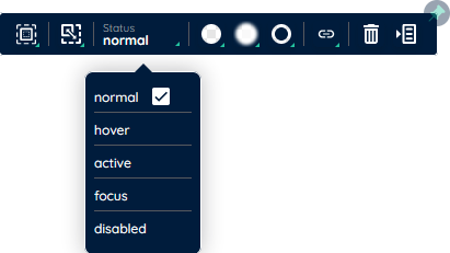
The State Picker determines the currently displayed state of a component. Each component has at least the normal state but can also assume other states such as hover, active, focus, disabled, error, readonly, or disabled. When a state is activated, only properties relevant to that state are displayed.
Sizing Picker
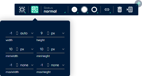
Through the Sizing Picker, you can determine the dimensions of a component. In the submenu (Toolbar Extension), you will find all properties related to size. You can also adjust the maximum dimensions of a component by dragging. To create good responsive behavior, the interaction between minimum and maximum size values is important. (Flexbox link)
Spacing Picker
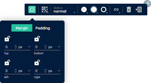
To define the spacing around the content (padding) of a component or between components (margin), the Spacing Picker offers adjustment options. Here, you can set the spacing from one or multiple sides simultaneously (1). To roughly define the spacing, you can also adjust distances via drag and drop.
Color Picker
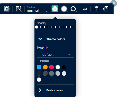
Each component also has a Color Picker for the background color. Each state has its own background color. When clicking on the Color Picker, Toolbar Extension opens, where you can adjust the opacity of the selected color (1) or choose a color from the theme color palette (2) and the base color palette (3). With the theme colors, you can switch between existing color palettes in the active SubTheme (4). The limited selection of colors is intended to help you maintain a consistent color style.
Typo Picker
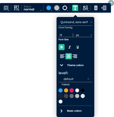
Some components offer labels and texts (e.g., yLabel, yTextBox, yButton, yInput, etc.). All relevant properties for these can be found in the Typo Picker's Toolbar Extension. Here, you can adjust the font family (1), font size (2), font style (3), or text color (4). When selecting colors, you are once again limited to the base and theme colors to enforce a consistent style throughout the application.
Border Picker
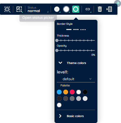
Another general property group is the border properties of components. Here, each state of a component can have its own defined border. When clicking on the Border Picker (1), you can adjust the thickness (2) and color (3) of the border.
Shadow Picker
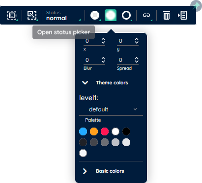
To adjust the shadow, the Shadow Bar offers options to define the shadow cast by specifying the X and Y position (1), adjust the shadow size and density using Blur (2) and Spread (3), and select a shadow color from the color palettes. The shadow can be defined separately for each state. import StatusPicker from "src/app/common/components/propertybars/propertybar1Picker/StatusPicker.vue"